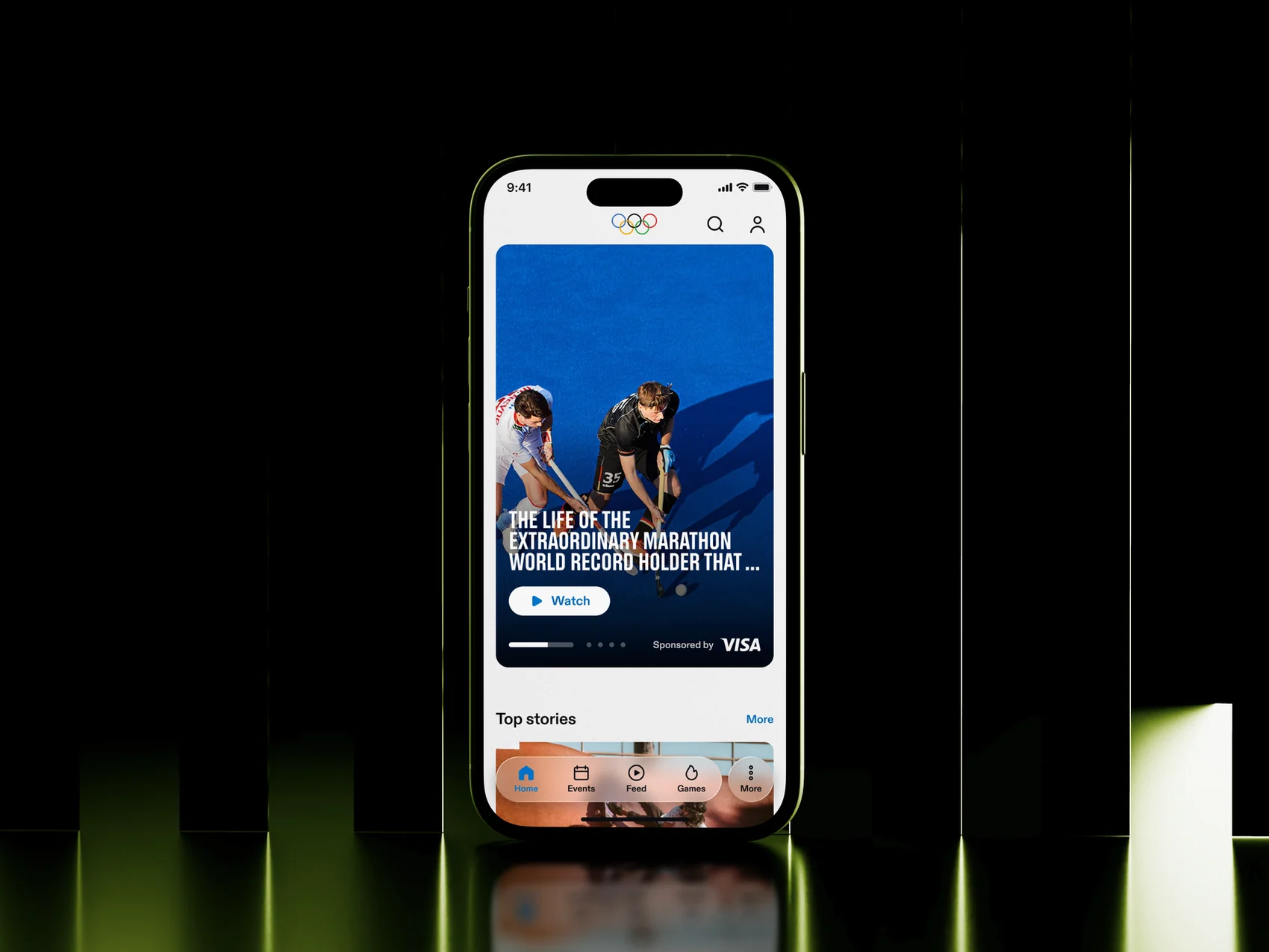
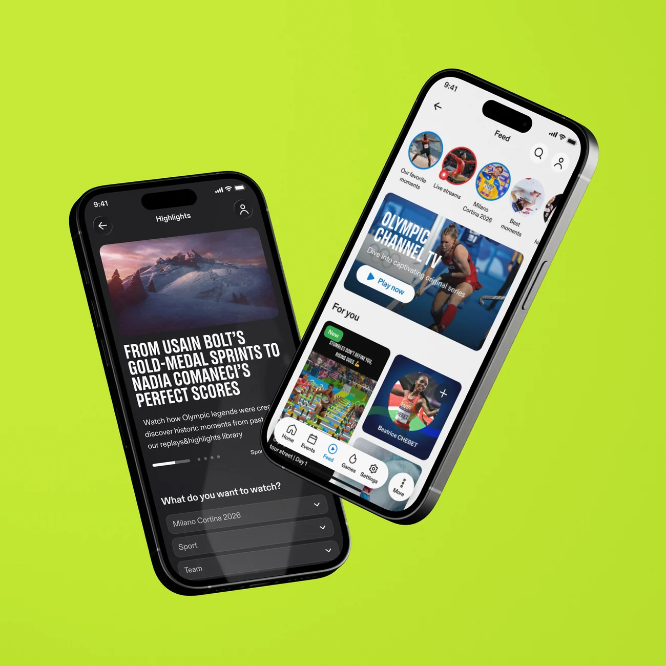
The official Olympics app: schedules, results, news and video — during the Games and between them.


The Olympics app delivered news but created no habit: zero personalization, no interaction, and no reason to open it between Games. A 130-year-old institution, dozens of sponsors and committees — and no room for mistakes.
Defined the product strategy and hypotheses, redesigned 20+ flows — homepage, feed, onboarding, guest mode, engagement — built two design systems from scratch, adapted for agent-based workflows, and validated the direction with research across three markets.
Shipped for Milano Cortina 2026. The app stopped being a news feed — it opens on what each fan follows, holds them through the day, and finally has a reason to exist between Games. Research singled out personalization as “demonstrably effective.”

"The old approach: put everything everywhere. The new one: give every piece of content its right place."
The Olympics app had accumulated years of features without a clear information hierarchy. Content was duplicated, personalization was non-existent, and the homepage tried to do too much at once. The challenge was not to add more — it was to make sense of what was already there, and design for what users actually needed.
The IOC is a 130-year-old institution. Dozens of sponsors, national committees, and stakeholders — all with a seat at the table. Design decisions don't move fast, so my job was to make every proposal self-evident: thorough rationale, clear tradeoffs, external research to back direction.
The Olympics app is a moment-driven product — interest peaks around events and stories, not a constant content stream. So engagement had to be built around deepening key moments, not infinite scrolling. I formalized this into two hypotheses and a four-step product strategy, which I proposed and defended to stakeholders.
Before committing to the new direction, we ran an external usability study: 29 participants across Germany, India, and the USA. We tested two app homepage variants, the new Feed prototype, and the live Olympics.com mobile homepage.
Every piece of content earns its own place — if it isn't immediately relevant, it doesn't lead. Users need a reason to come back every day: the feeling that the product is alive and relevant right now. Personalization comes first — the user shows us what matters, and the product shows more of it, active and passive, without losing the joy of stumbling onto something new.
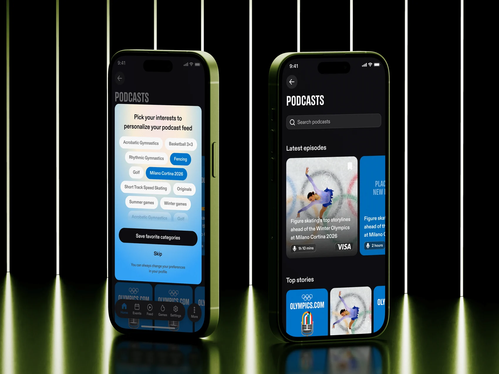
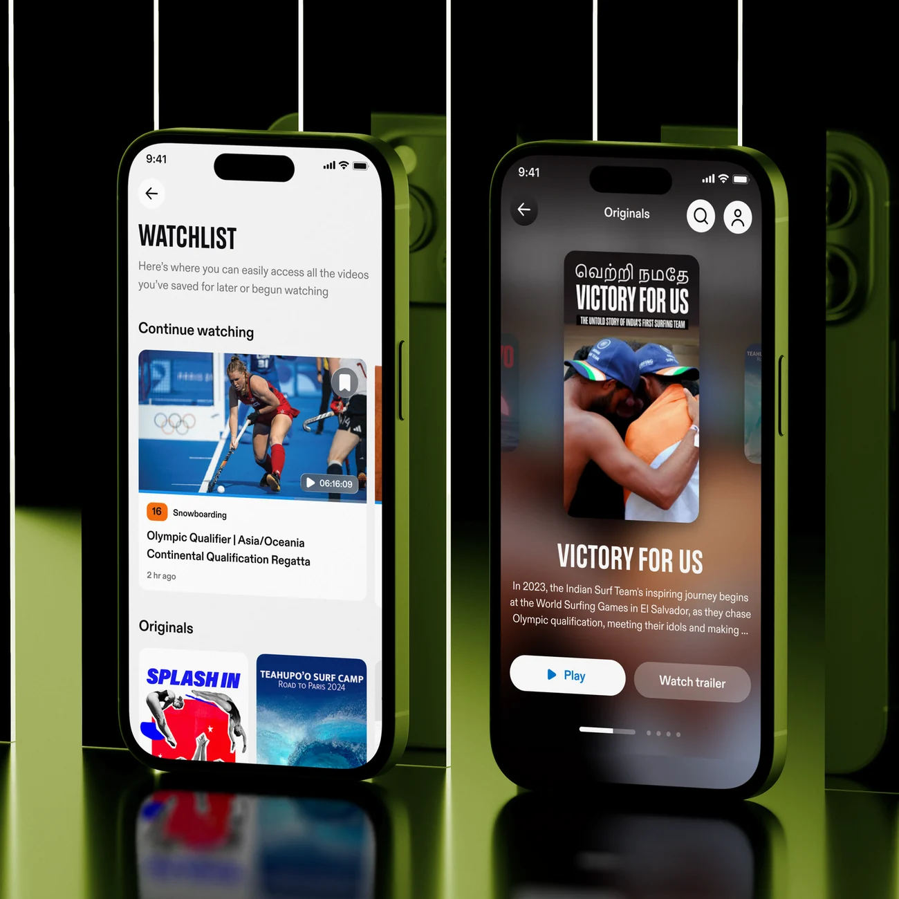
A deliberately small selection — only the most visible changes. The full redesign covered 20+ flows across the entire app.
Making "Continue as guest" a first-class path meant defining how every screen behaves without an account. I audited the whole navigation map and reduced it to a reusable system: content always visible, personalization locked — six treatment types, three prompt intensities.
Interactive moments tied to live events — predict outcomes before, react after. Surfaced contextually in the homepage and feed, not as a standalone feature.
Guests browse freely. Registered users unlock personalization, polls, and persistent favorites. Registration becomes a value exchange — not a barrier.
Favorites no longer just save content — they shape what appears in the feed and homepage. The foundation of personalization, in rollout when I handed the work over.
This is not a project where I executed someone else's vision. The product direction, improvement proposals, roadmap priorities, and all design output are mine. My PM approves — the thinking comes from me.
During the Games (February 11–17, 2026), an independent fan research community — 58 Olympic fans across France, Italy, and the USA, half on the app and half on mobile web — evaluated the live experience day by day: from schedules and results to editorial content, personalization, and key journeys.

